Payactiv
Payactiv is a fintech startup that pioneered Earned Wage Access (EWA) in 2012, providing an alternative to payday loans that often exploit hourly workers. In 2021, Payactiv came to frog to regain its leadership in a space through exceptional user experience. I led the redesign of the mobile app with a focus on simplifying the experience and empowering their users to easily access their earned wages.
Client
Rakuten
Role
Design Lead, Interaction Designer
Team
Executive Design Director (Anto C.), Program Manager (Casey C.), Visual Designer (Joyce L.), Engineer (Karl C.), Content Strategist (Laura B.)
From access to livelihood
Although Payactiv pioneered the Earned Wage Access space, many competitors were now encroaching on their market share. As they launched more features and functionality, their core value propositions and app experience became increasingly confusing and convoluted.
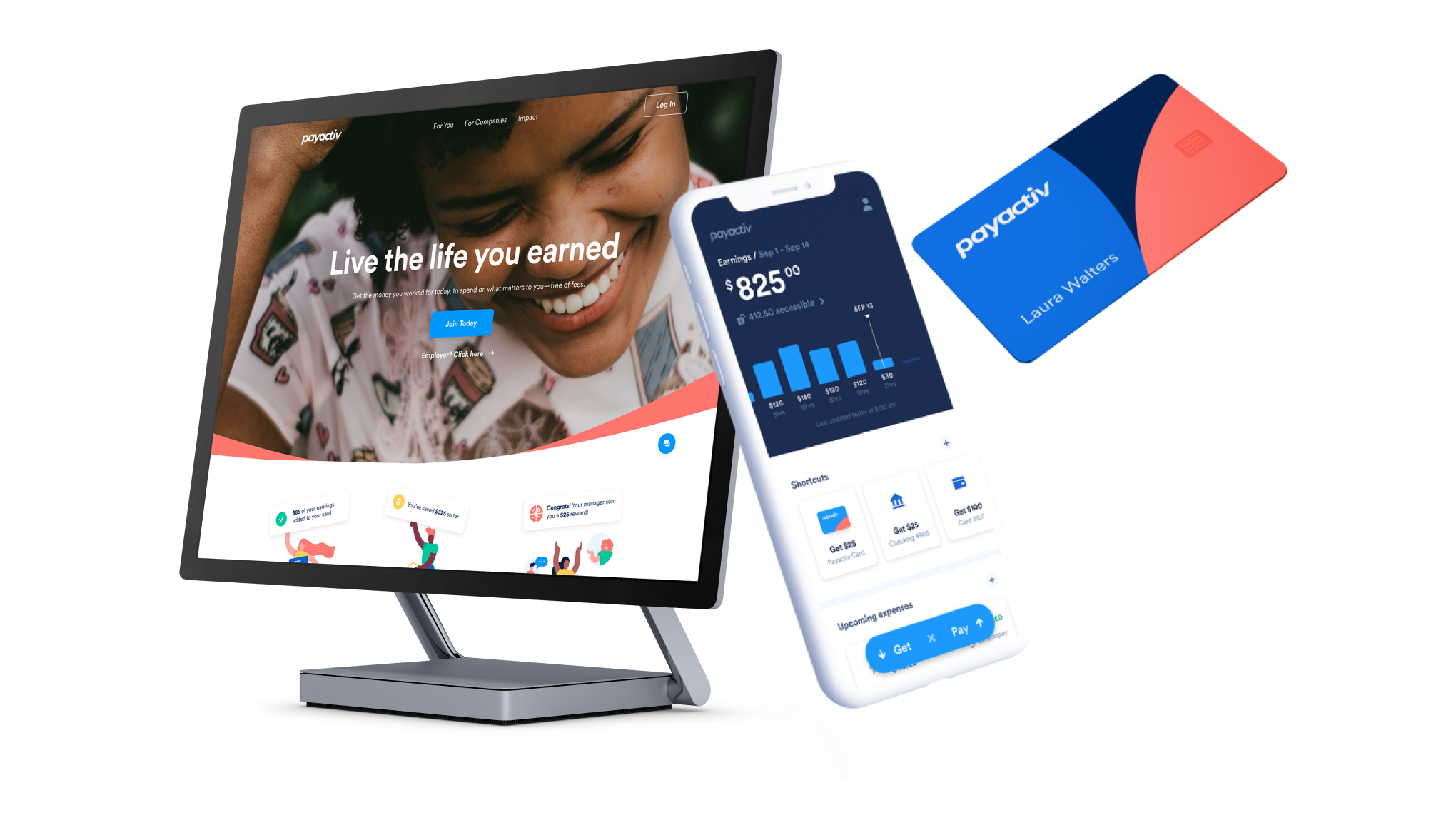
One of the main goals of the app redesign was focused around simplifying the overall experience and focusing in on the key functionality that would drive engagement. We saw from prior user research that Payactiv users often opened the app simply to track their earnings. Keeping that in mind, we redesigned the landing page of the app to focus on keeping users up to date with their hourly wages as well as providing quick shortcuts to easily access their funds.
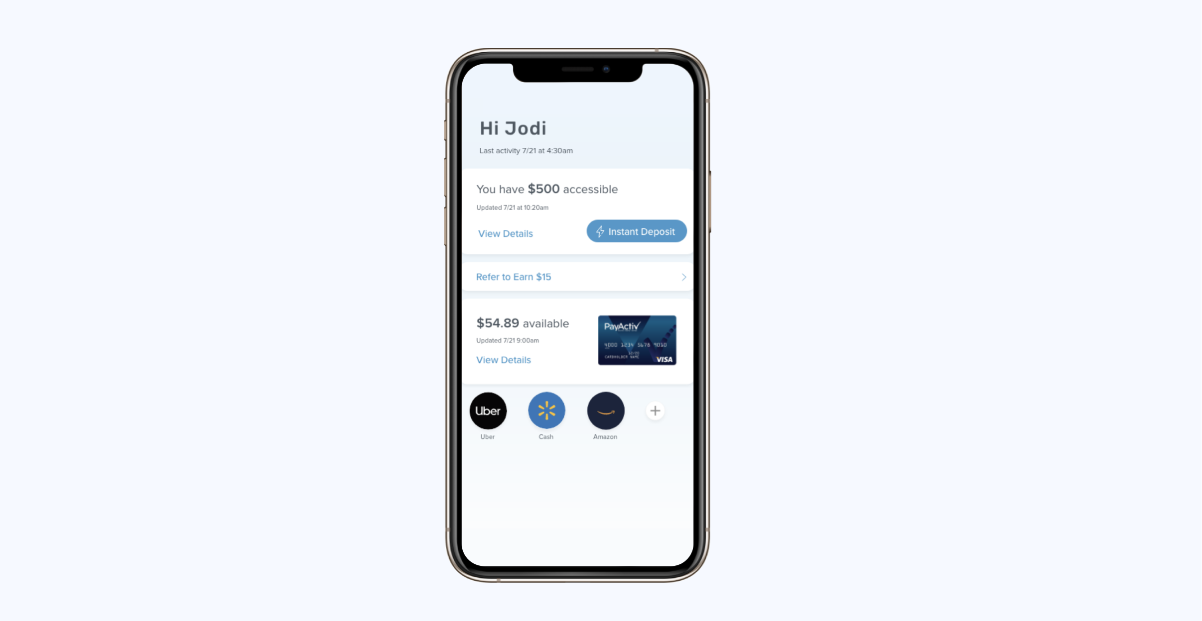
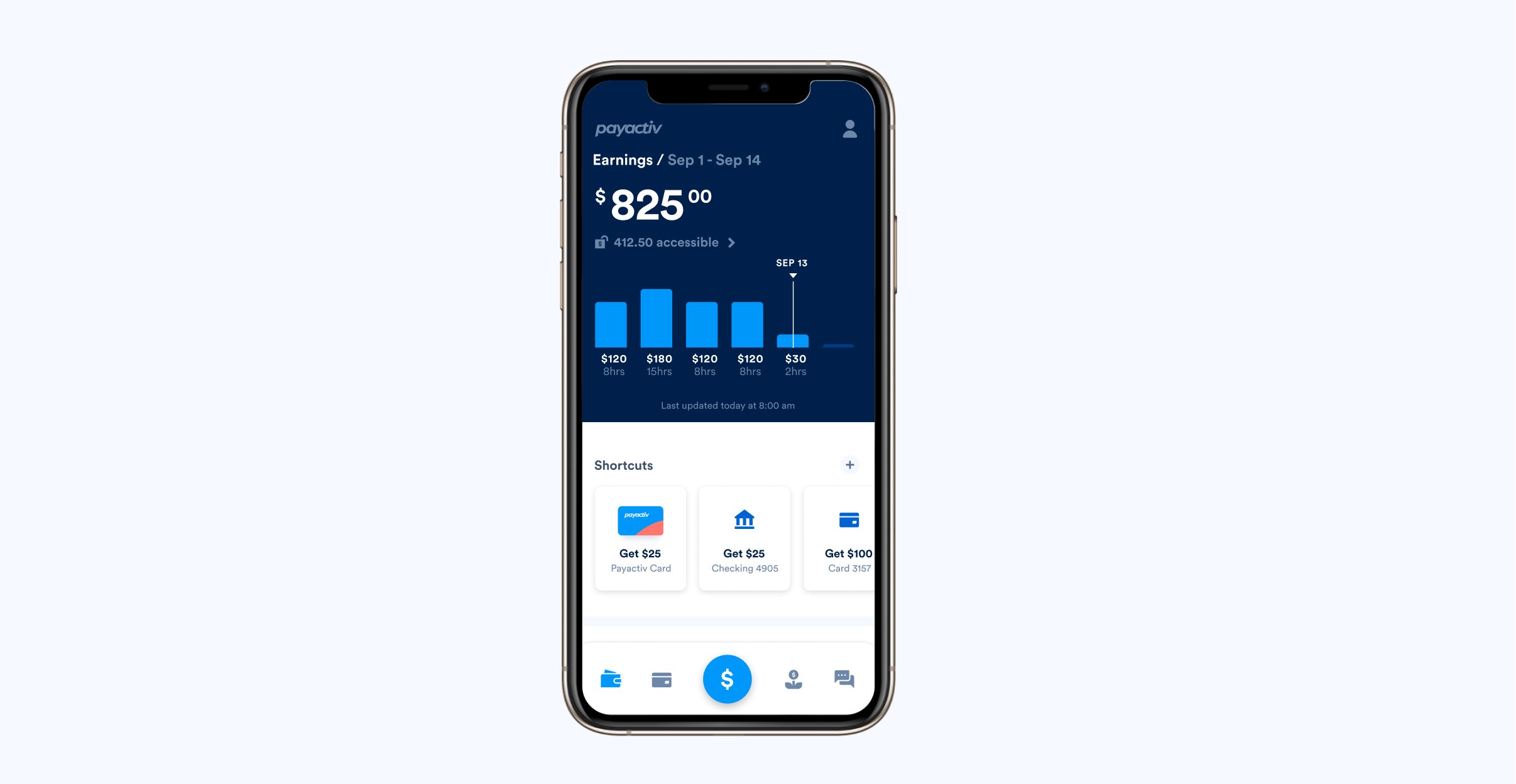
A before and after of the landing page of the app. The new landing page allowed users to easily track their earnings as well as quickly access their funds, the most used feature based on app tracking.
Prioritizing requirements
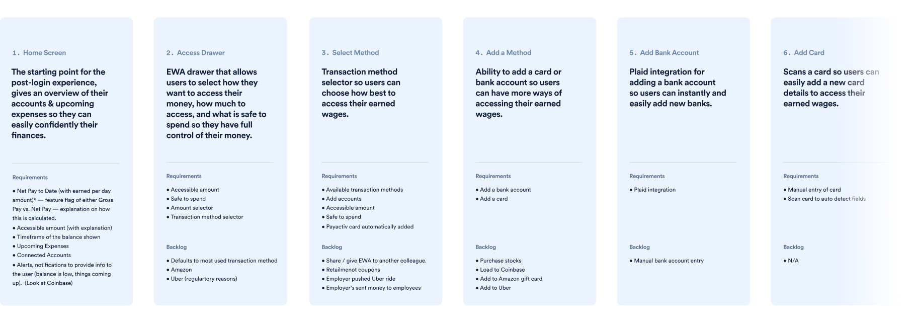
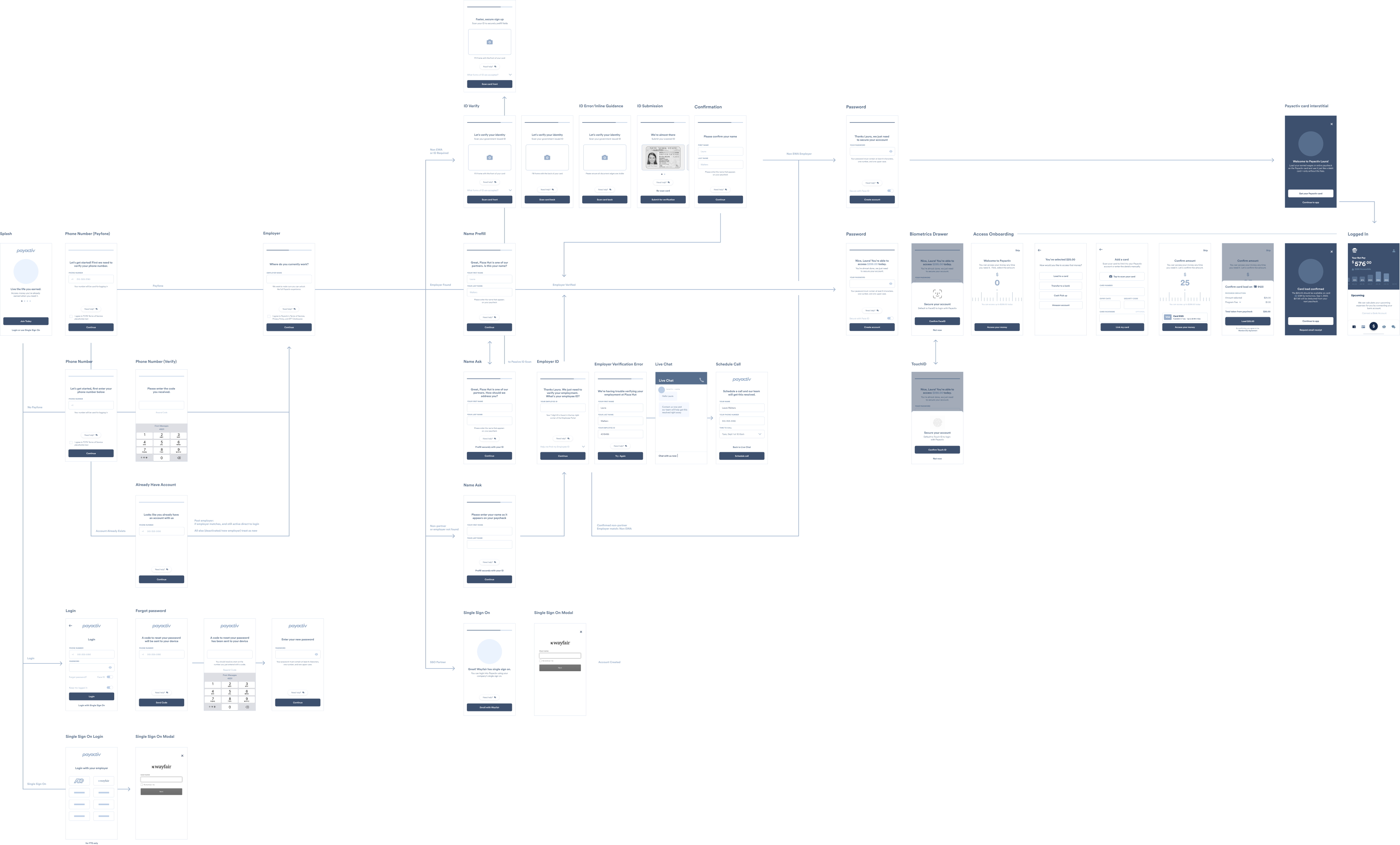
Before diving into sketches and wireframes, we took a step back and first mapped out the foundational flows of the experience:
- Sign up
- Accessing earned wages
- Bill management
- Peer referral
- Savings
- Card management
For each flow, we worked together with engineering and product management to align on the key user and technical needs.
Designing a scalable navigation
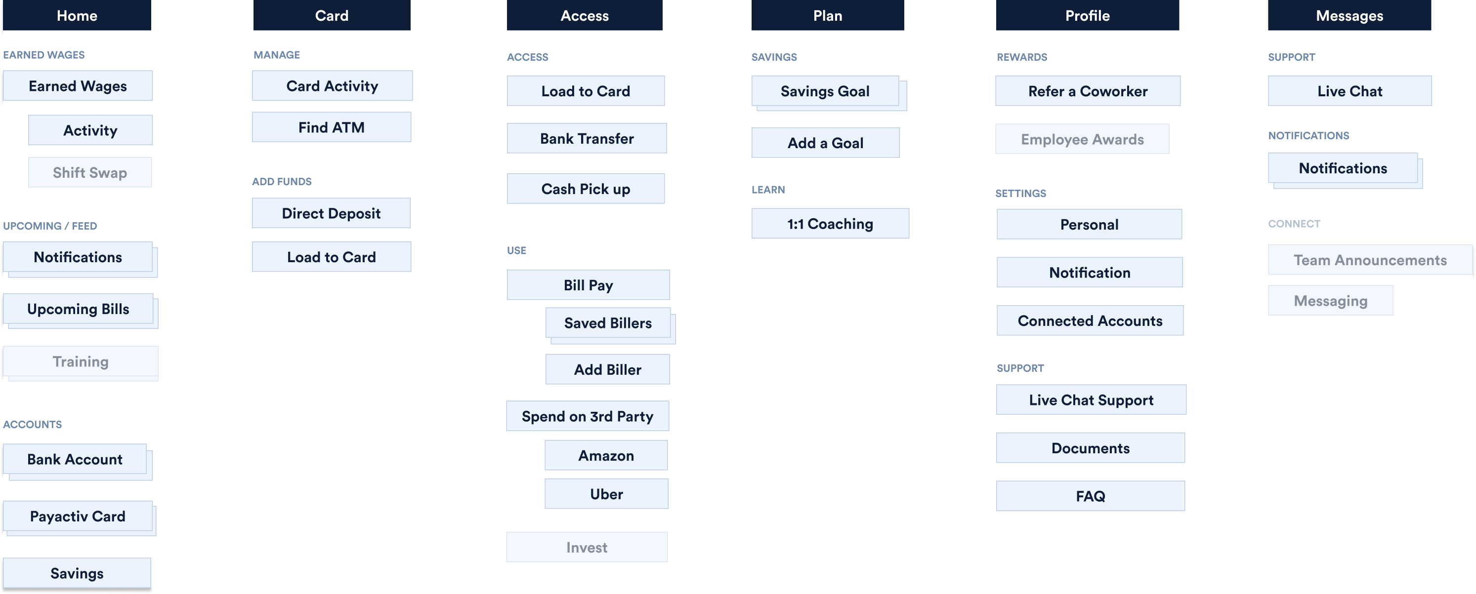
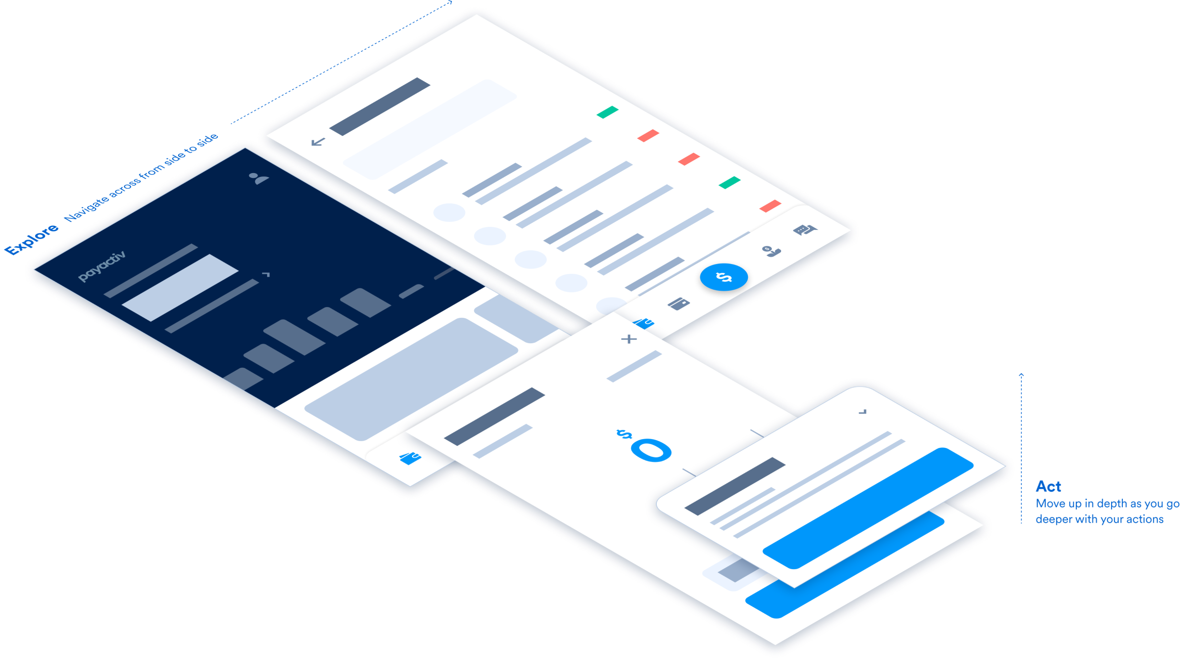
We explored multiple sets of information architecture and navigation options, but ultimately selected the option that allowed the app to easily scale. From customer research, we saw that majority of users tended to open the app simply to view their account balance and available funds. With that in mind, the landing page of the app became the wallet. Other key functionality included being able to manage bills, use a digital card, and manage saving funds — each of which became core pillars of the app's navigation.
Ensuring access is always available
Payactiv's bread and butter is EWA, or the ability to allow hourly wage workers to access the wages they've earned before their paycheck comes. As accessing money was the crux of the overall product experience, we wanted to design an interaction model that mirrored how crucial this functionality was. The "universal access drawer" is accessible in the global navigation at any page of the experience, allowing its users to easily use the money they've earned.
Putting the experience altogether
For each flow, we began by wireframing out the experience in thumbnail wires. Each wireframe was reviewed with product managers and engineers to ensure feasibility — it also gave a chance for the developers to begin working on the backend even before any designs were ready for production.
Once wireframes were approved, we moved onto higher fidelity mocks and exploring animation within our interactive prototypes. Within 3 design sprints (or 6 weeks), we were able to fully redesign the new app experience in high fidelity.
Key results
The new app experience is fully launched and available for download in the app store, with an average of 4.8 stars with 38k reviews. Since launch, we've won 3 design awards including the 2021 Digital Wallet Impact Innovation Award, 2022 American Business Award, and the 2022 HR Tech Award.
40%
2x
3
Rise in User Engagement
Customer Acquisition
Design Awards
